
Ulla Puggaard Ltd
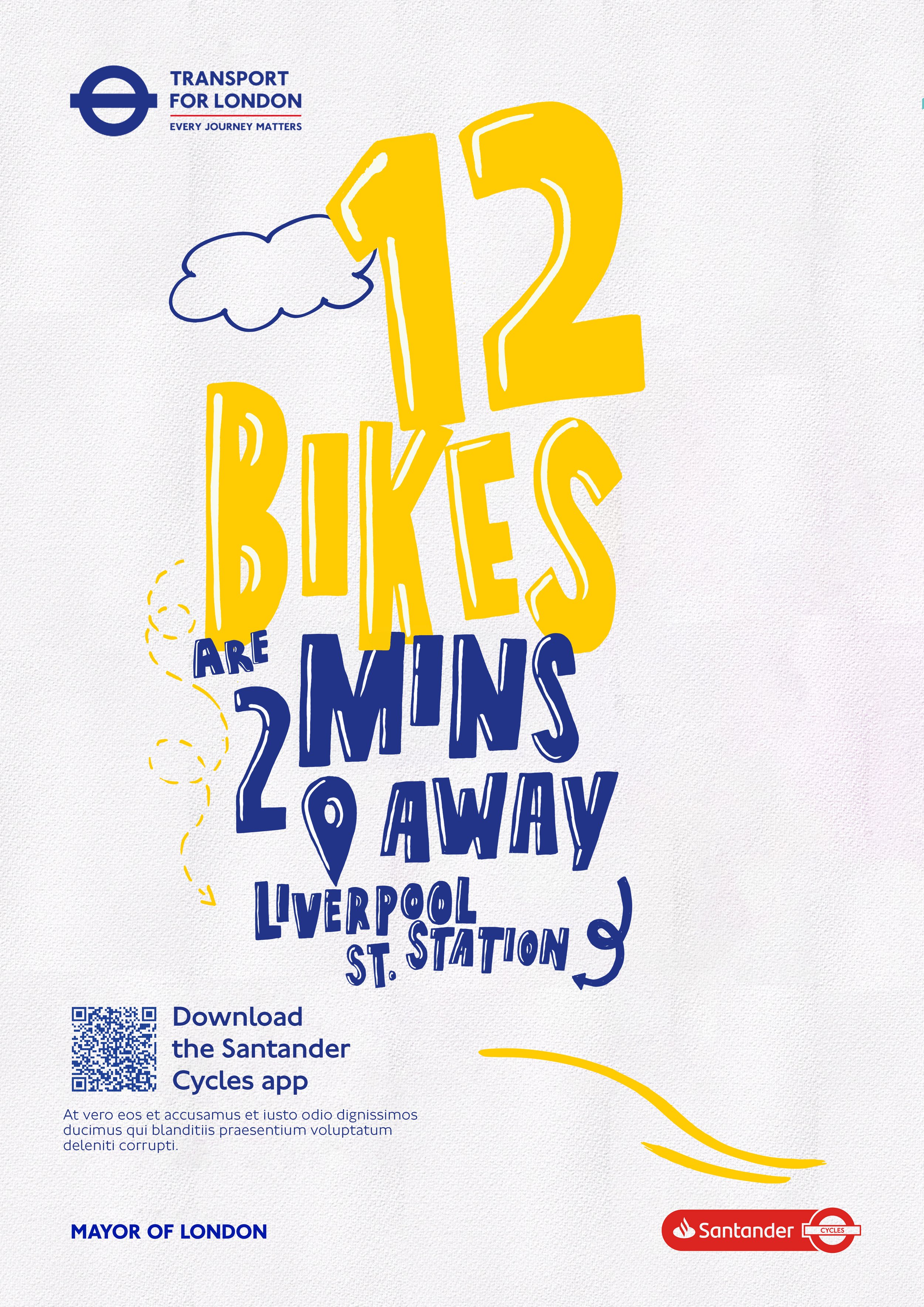

This typeface was part of an early exploration for the TFL Santander Bikes project, but ultimately didn’t make the final cut. Still, it’s one I keep returning to.
The cutout approach feels especially versatile there’s a balance between clarity and character that suggests it could be pushed much further. It works both with and without highlights, offering different moods depending on how it’s applied.
There’s something about it that continues to pull me back. It feels unresolved in a good way like it still has more to say.